PDQ Menu Redesign
Description:
For this project, I wanted to redesign the menu displayed in the drive-thru at PDQ, a fast food chain. Working there for a few years, I have firsthand experience with how the customers experience and navigate the menu and the problems that arise from its design.
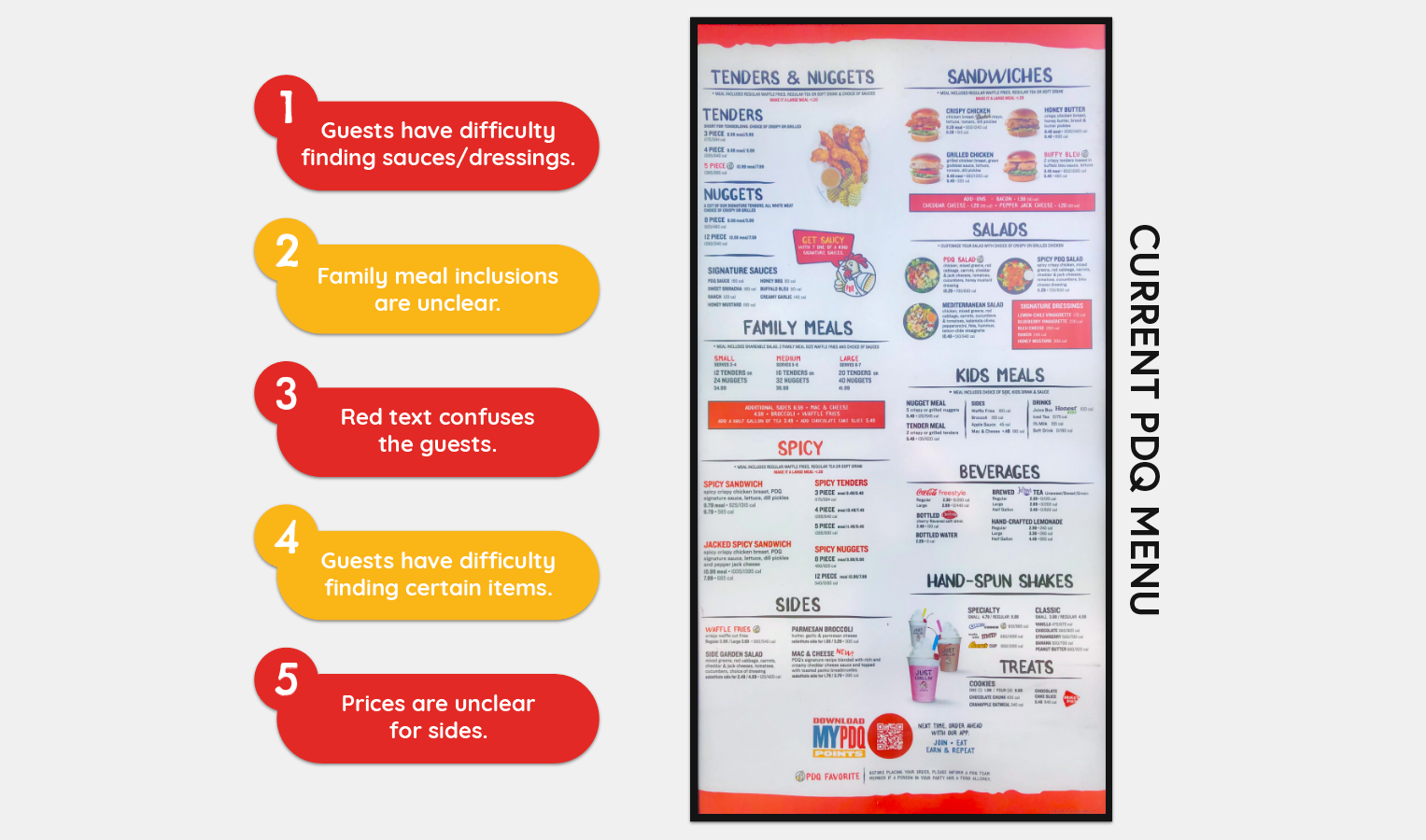
E X I S T I N G P R O B L E M S
P R O B L E M 1
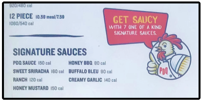
Guests have difficulty finding sauces/dressings.
One of the biggest issues with the menu, that slows down and confuses most customers, is the whereabouts of the sauces that we offer. Most guests looks towards the bottom of the menu and are scanning the menu for anything that resembles an image of sauce. This slows down the time taken to complete an order and can cause frustration with the guests.
C U R R E N T
R E D E S I G N
The sauces are listed with only their names.
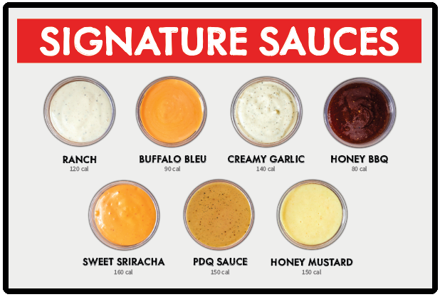
The sauces are listed with images that are recognizable from afar and customers can find them at a quick glance.
P R O B L E M 2
Family meal inclusions are unclear.
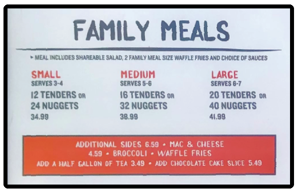
Another issue that customers face when ordering is that they do not understand the family meals that we offer and what is included. They sometimes expect to get both the tenders and nuggets listed under each size. The sides that come along with the meal is also a point of confusion.
C U R R E N T
R E D E S I G N
There are too many words and the “OR” is too small to be easily visible by customers. The additional sides being boxed away from the rest of the section makes it so they feel separate.
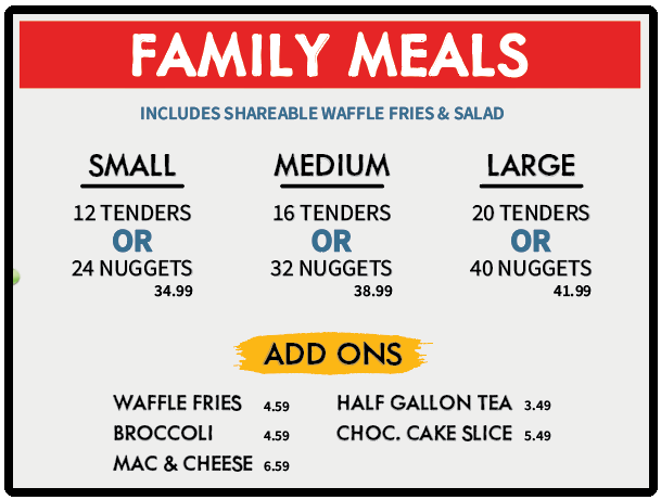
Less words to read, making the important information stand out more. The “OR” is also more emphasized to let the guests know what they exactly they are getting. The “ADD ONS” section cleans up the additional items and makes it more concise.
P R O B L E M 3
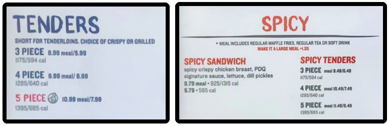
Red text confuses the guests.
A common occurrence is guests asking what does it mean for the text to be in red. The answer is that it denotes the selection as a “PDQ Favorite”; however, the red text is also used for the spicy section and various other areas for emphasis. This creates confusion and has some customers asking if certain orders can only be spicy.
C U R R E N T
R E D E S I G N
The 5-piece tender meal is in red text and some people think that it only comes spicy. The spicy section of the menu also takes up extra space and is not necessary.
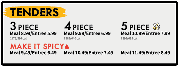
Rather than a spicy section, I created a new icon to specify a spicy selection. In doing so, I was able to condense the menu. PDQ favorites and spicy food now have their own icons.
P R O B L E M 4
Guests have difficulty finding certain items.
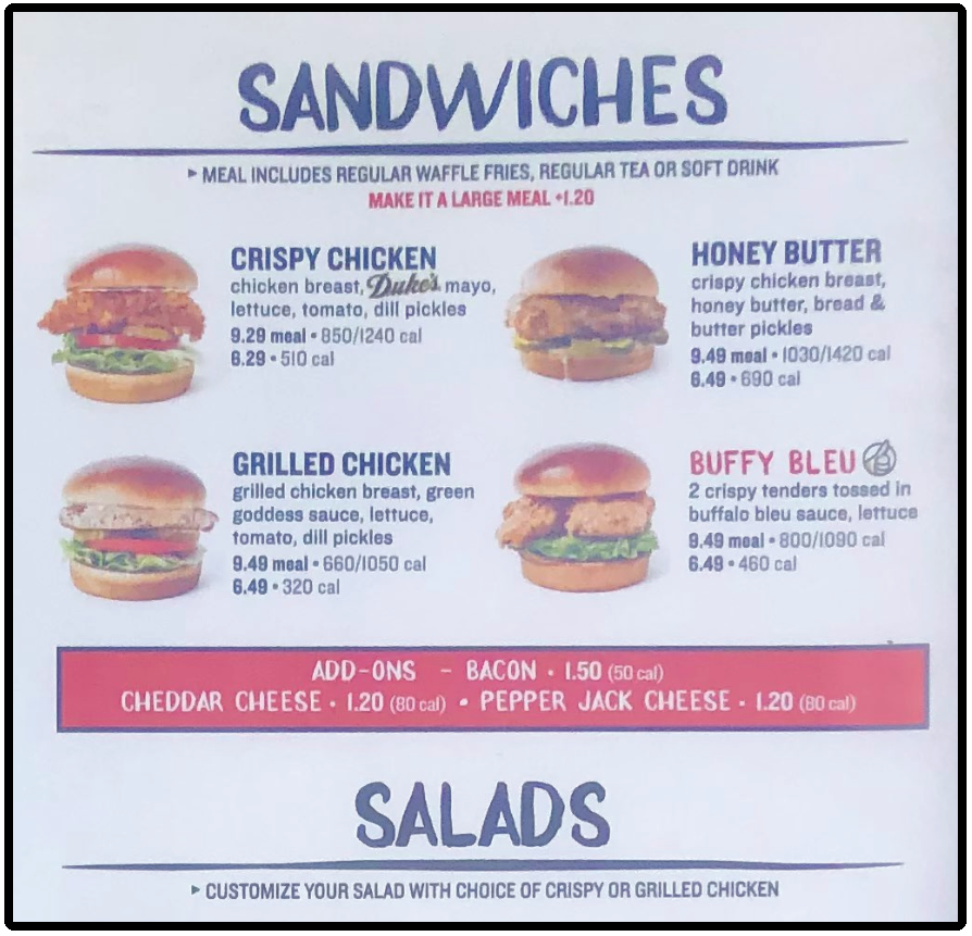
With a lot of lines and boxes, the current menu is not effectively organized. The sections are not clear and some information can get lost due to the clutter. A goal of mine was to clear up the menu as much as possible and rid of any information that was not being read by the customer anyway, or putting it somewhere that made more sense.
C U R R E N T
R E D E S I G N
The underlining of the headers separates the entire section from its title and can be confusing at first glance. The “ADD ONS” section is once again boxed off and is disregarded as irrelevant information by our customers.
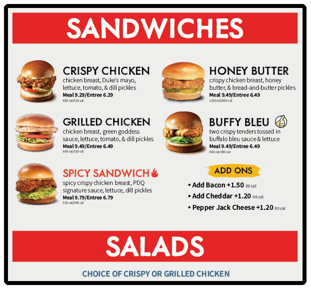
The menu here is much easier to understand and there are no lines separating the header from the body of its section. Less boxes of information and a highlight to bring emphasis to the optional add ons.
P R O B L E M 5
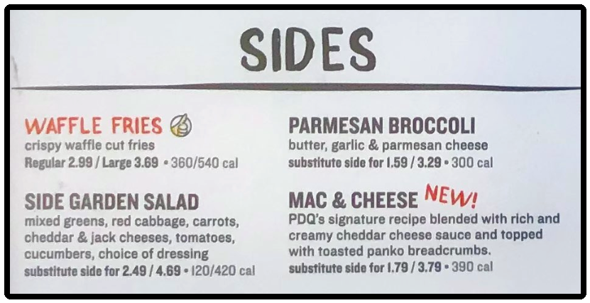
Prices are unclear for sides.
The price listings below the side options confuse the guests as well. They tend to think there are multiple sides or question what the two different prices are for at all. This can also cause guest frustration when they think they are able to buy a side for the first (cheaper) price listed.
C U R R E N T
R E D E S I G N
The price listings here make it seem that there are multiple size options for our sides however only fries are available in “Large.” This is due to the placement of the “substitute side for” text.
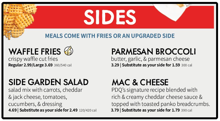
With the side’s original price being listed first, there is now a division between the two listed prices and the second price is preceded by the fact that it is the substitution price.
C O M P A R I S O N
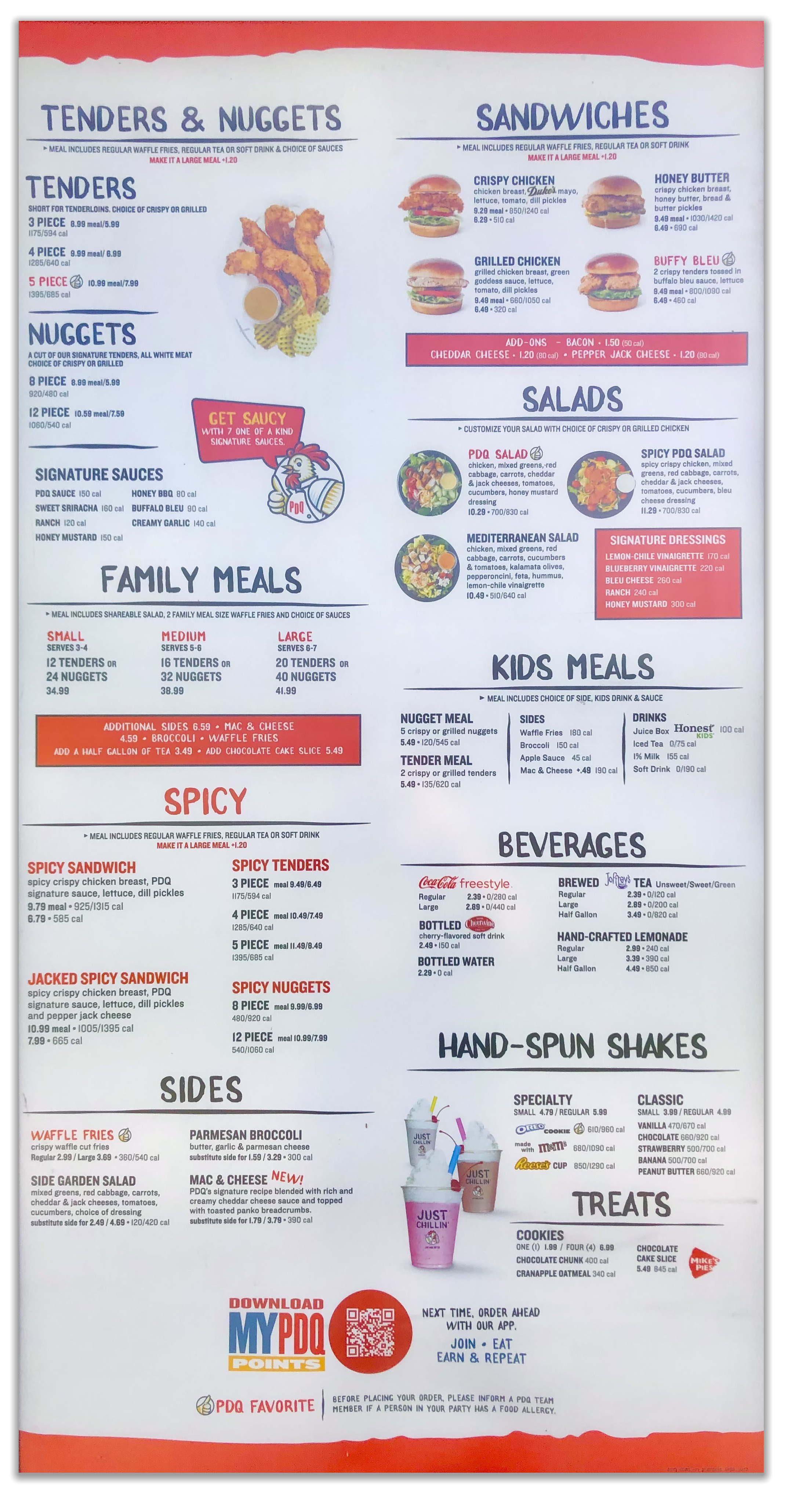
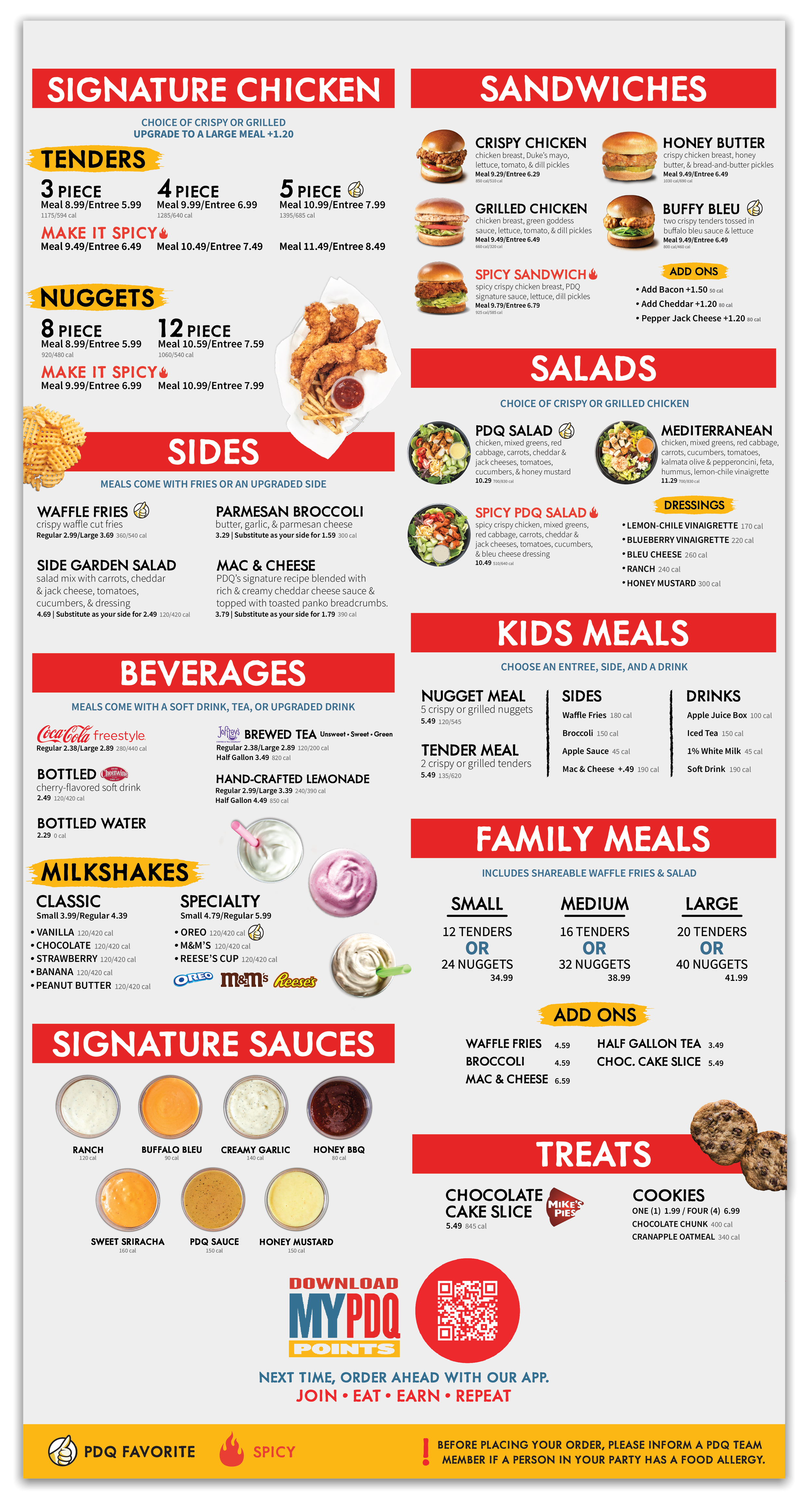
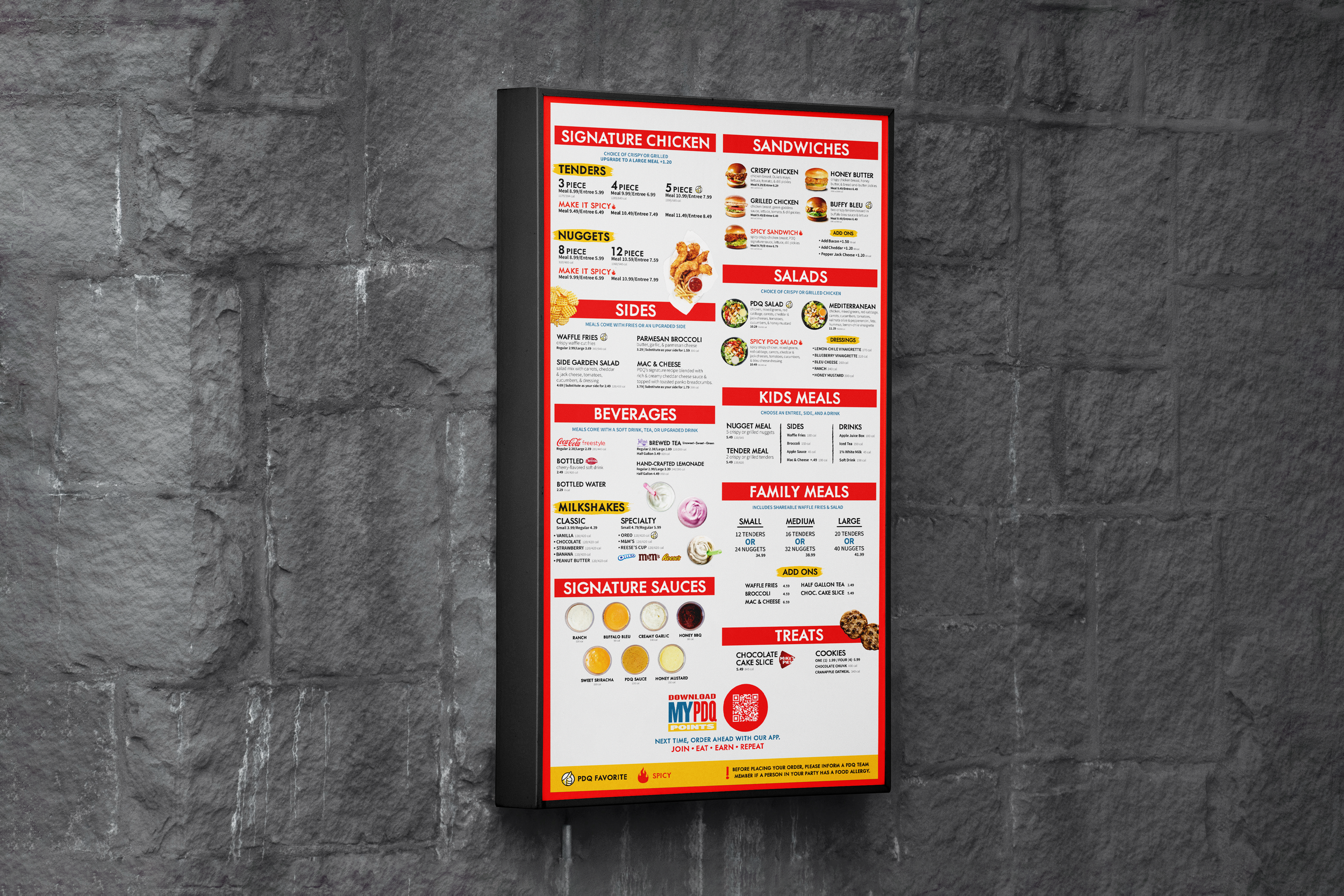
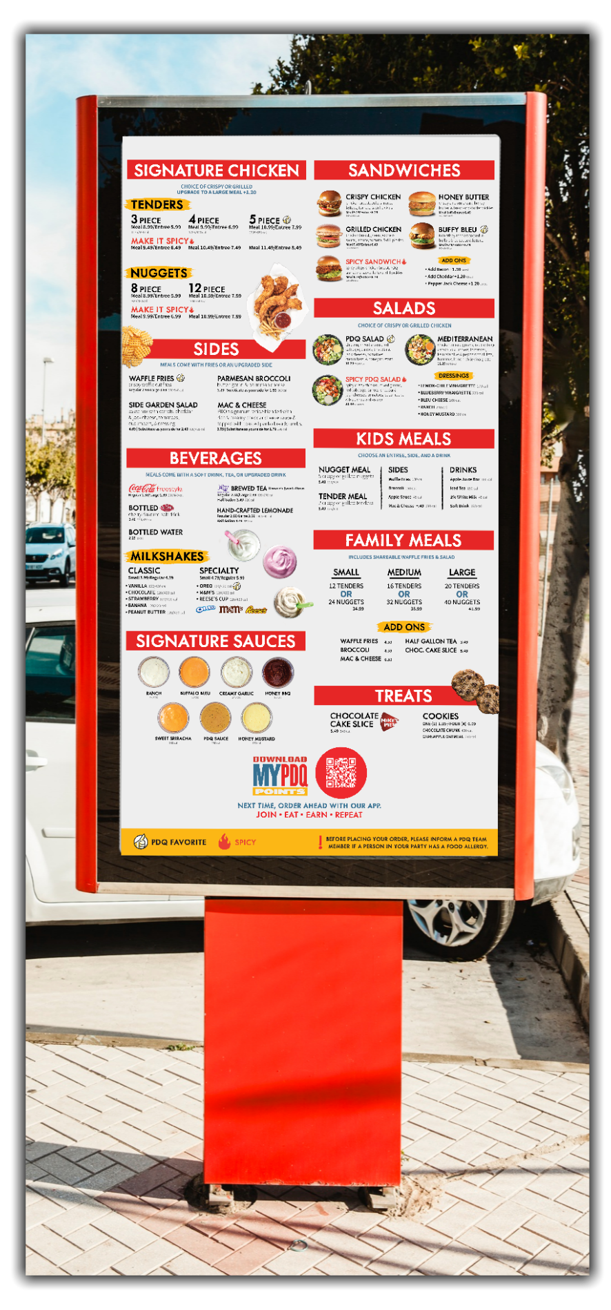
A side by side comparison of the current and redesigned PDQ menus.
Information is better organized, more concise, and easier for customers to find.
C U R R E N T
R E D E S I G N
D E T A I L E D C H A N G E S
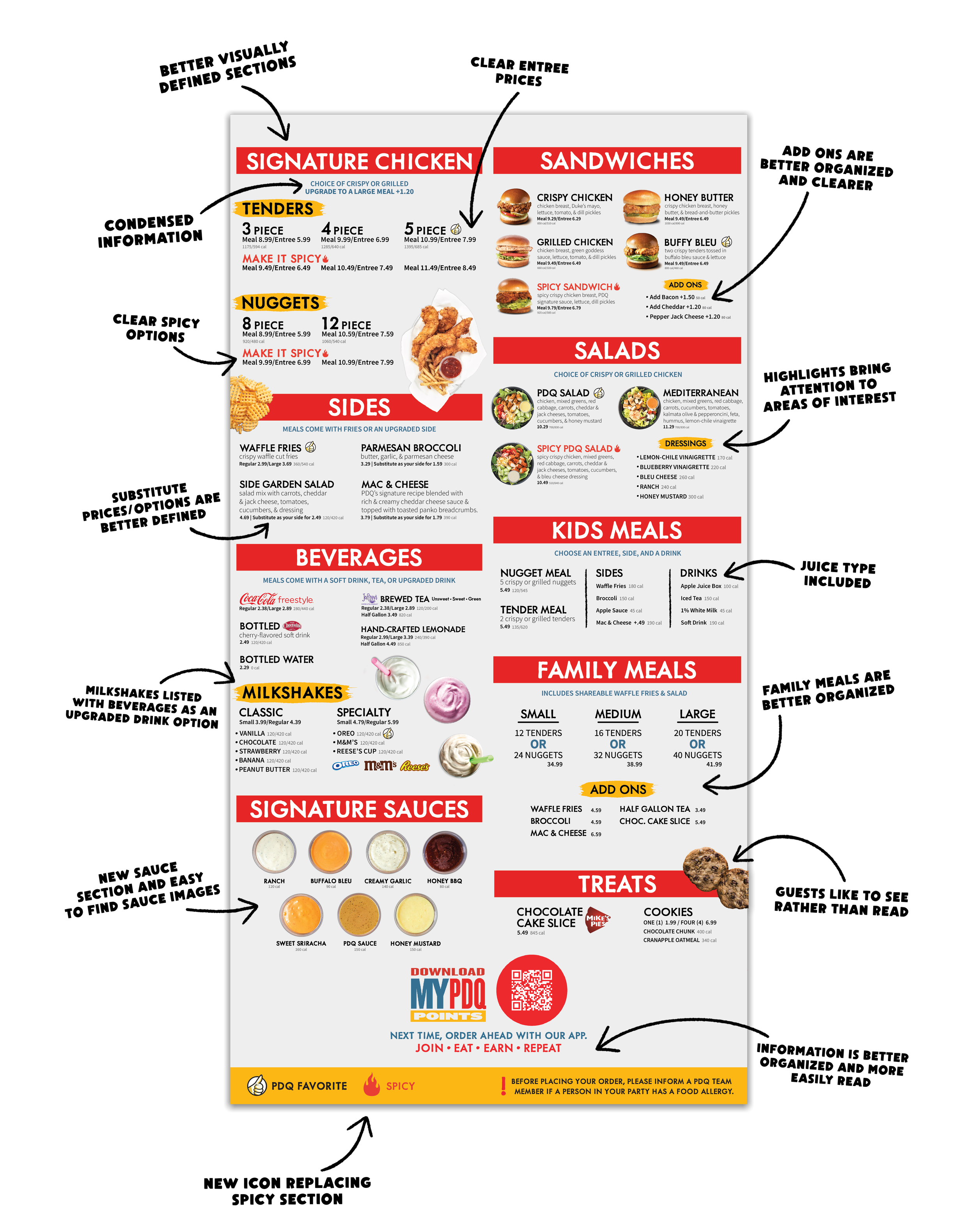
This visual annotates most of the redesign choices made to the menu.