Pokémon User Interface Redesign
Description:
This is a mini project in which I wanted to redesign the battle user interface from Pokémon Sword and Pokémon Shield. Being a fan of the series, I thought that the user interface could have better complemented the gameplay, and in this project I attempted to accomplish that. I wanted to maintain the modern aesthetic of the game’s interface while improving its functionality.
I C O N O G R A P H Y
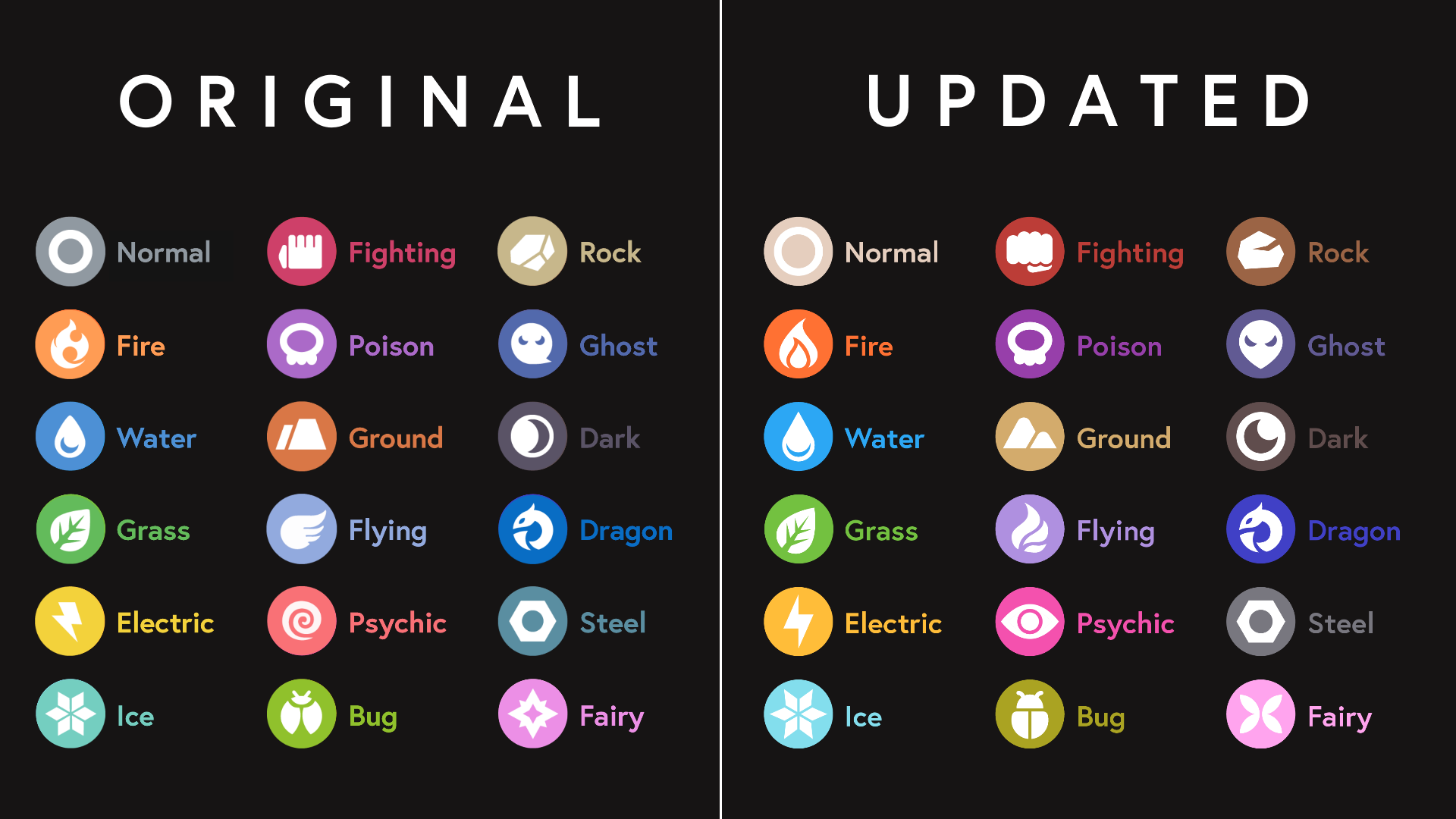
To start, I knew I wanted to better incorporate the Pokémon typing into the interface.
For this to be successful, the colors and icons needed to be better read and differentiated when very small.
P O K É M O N E N C O U N T E R
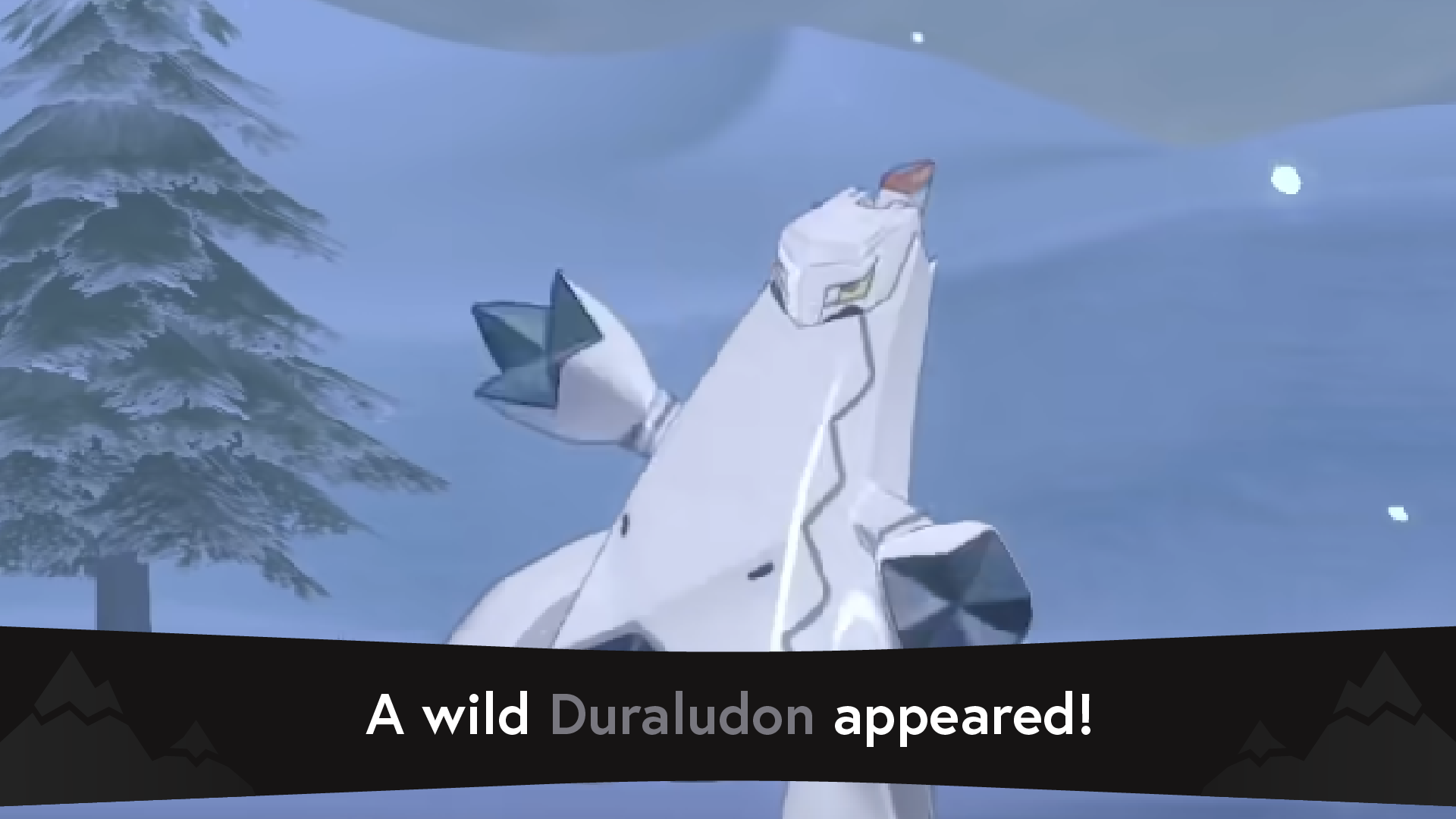
Pokémon Sword and Pokémon Shield use a lot of text boxes to convey their messages. It creates uniformity across the game’s interfaces, but leaves for little room of any dramatic effect or emphasis.
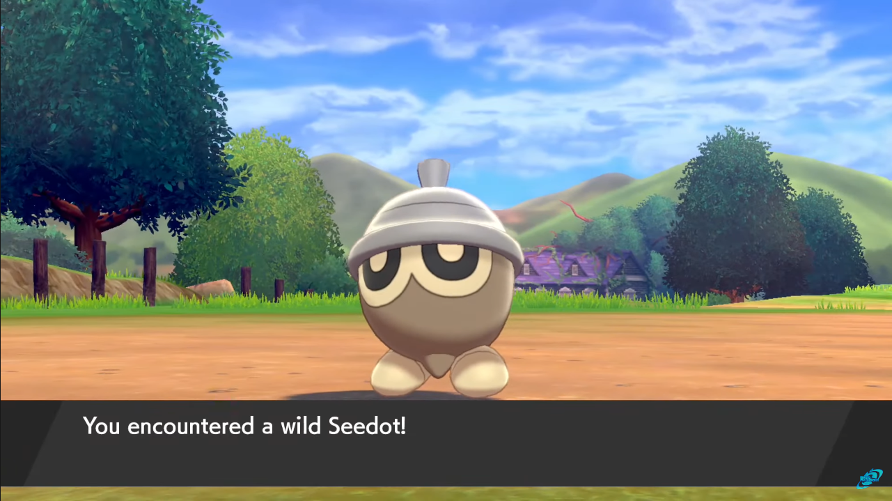
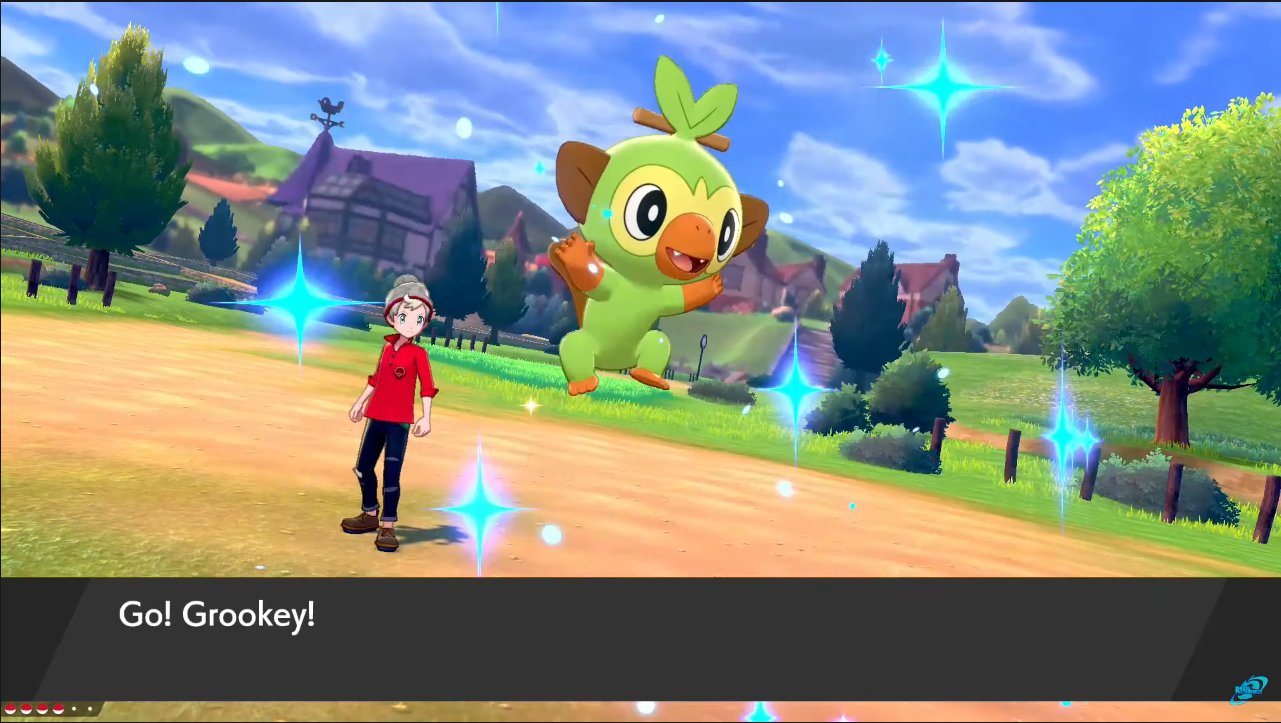
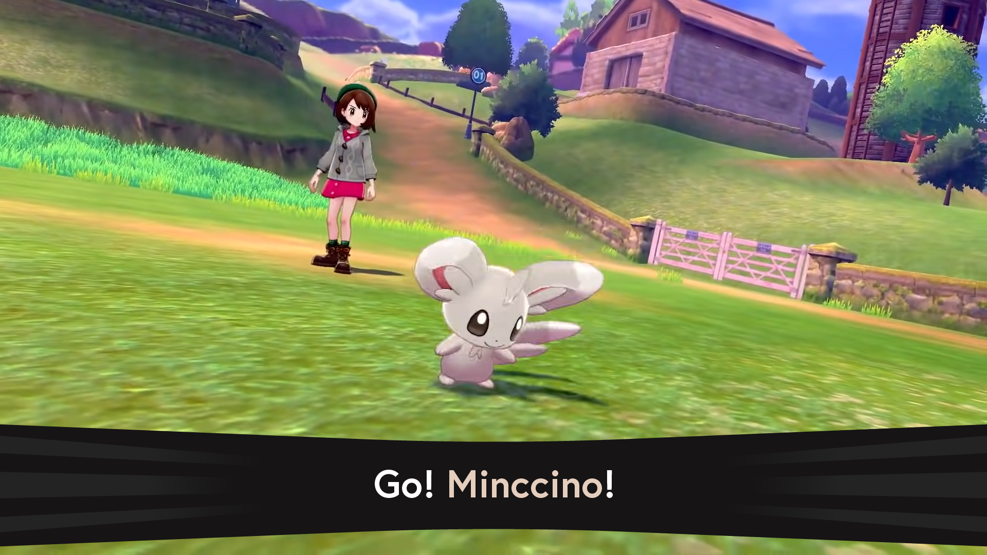
O R I G I N A L
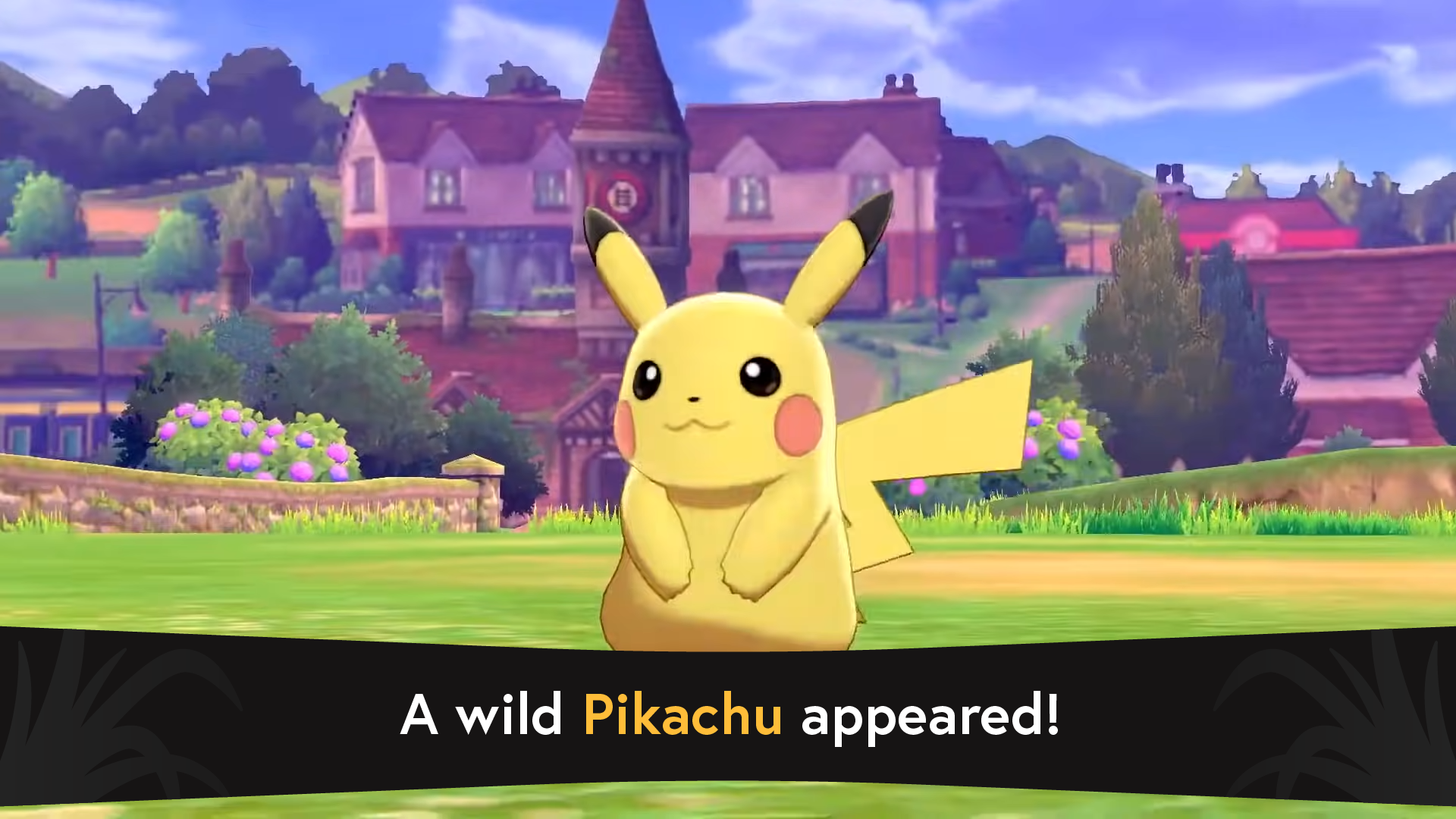
R E D E S I G N


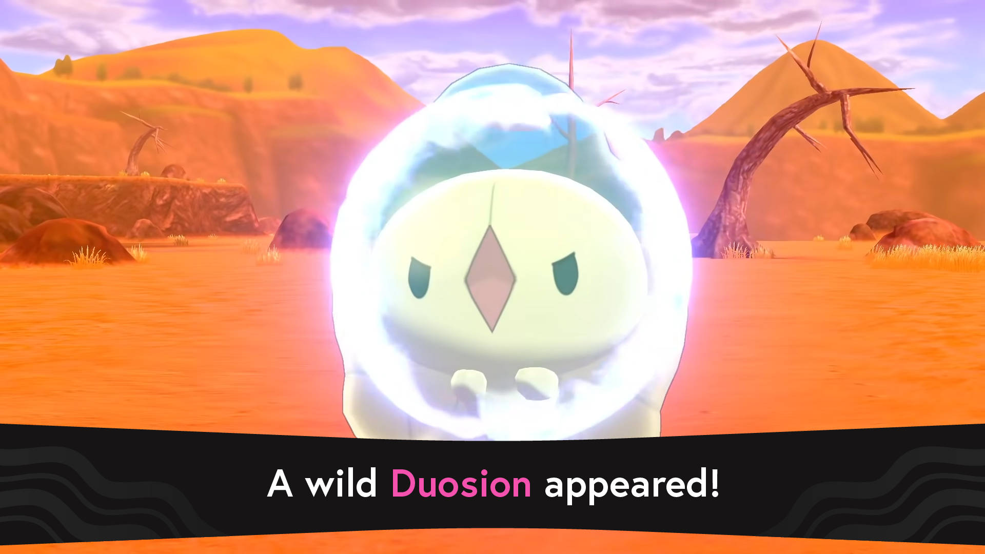
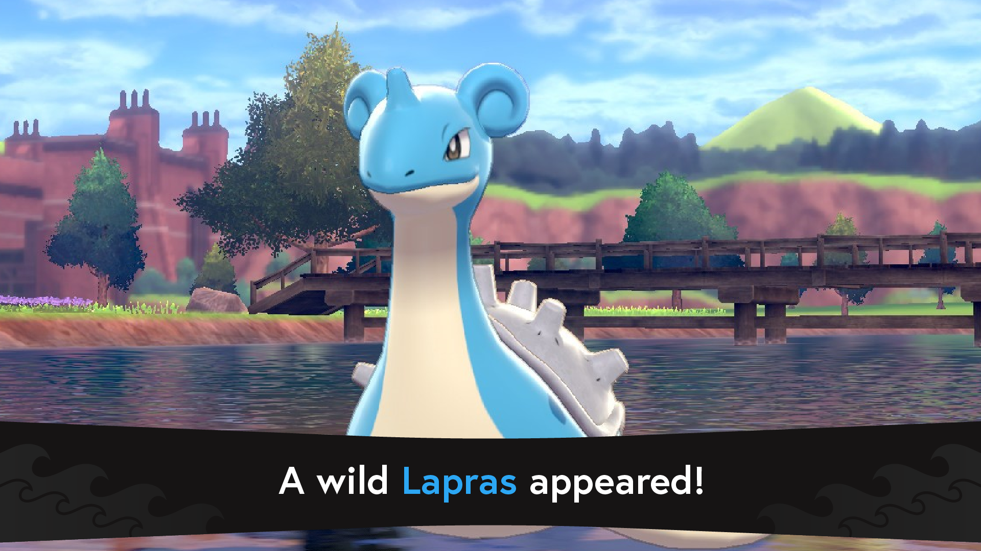
Making the interface more exciting.
With the redesigns, I wanted the encounter event to feel more impactful and look cinematic. Larger text, interesting shapes, and use of color were what I wanted to implement to do just that. With the Pokémon’s main “type” as the color of their name and different accenting graphics based on the player’s environment, the experience is intensified.
M A I N I N T E R F A C E
O R I G I N A L
R E D E S I G N

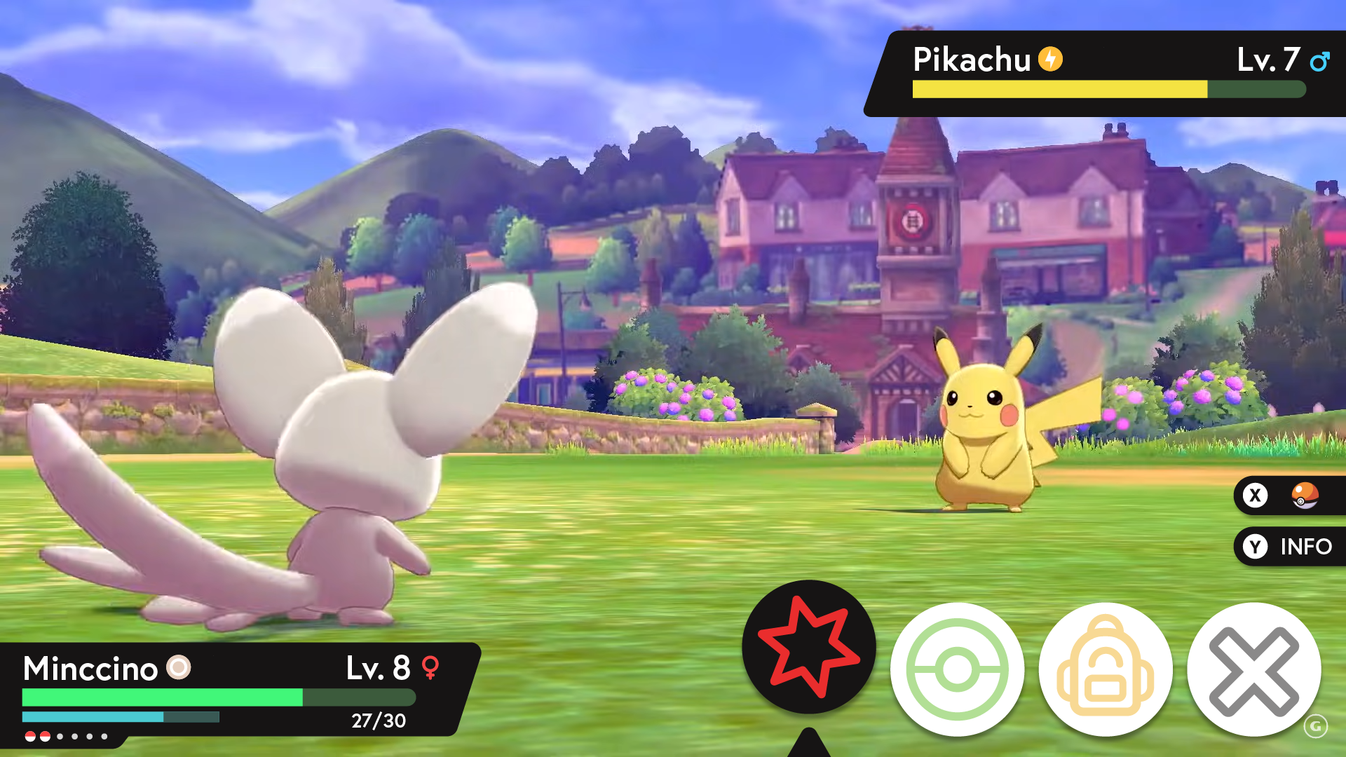
Opening up the visual space for the Pokémon.
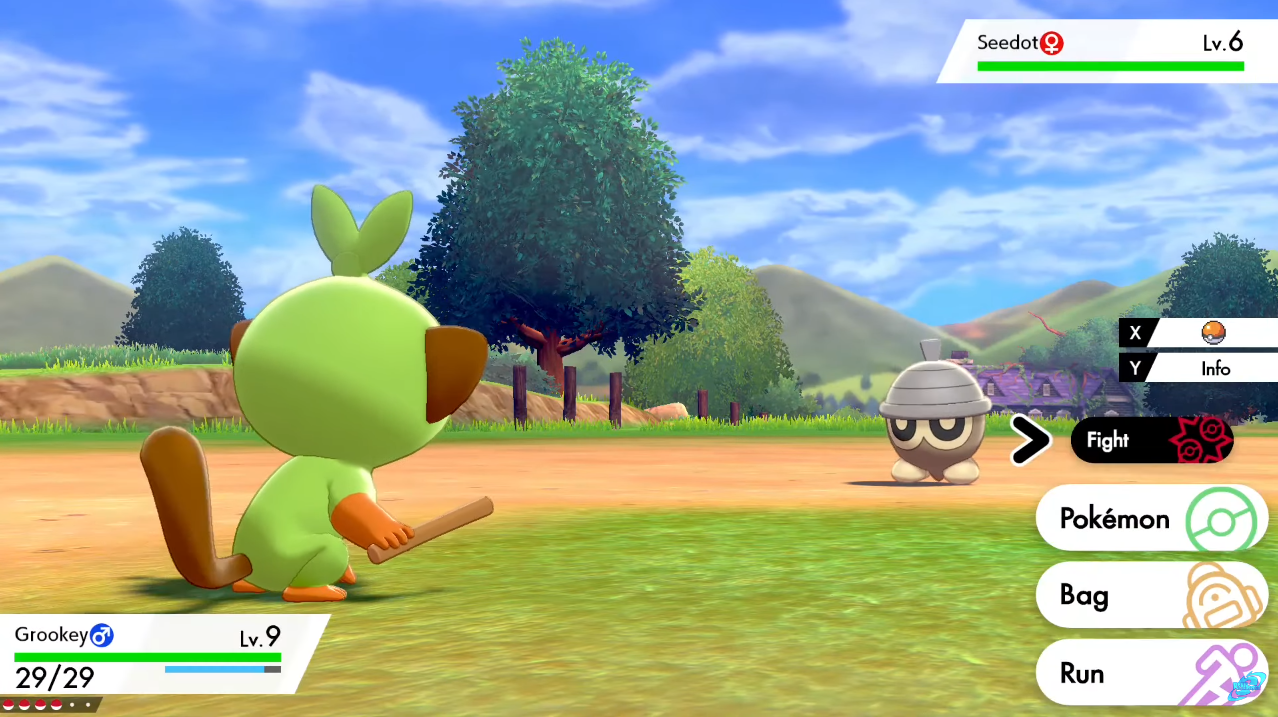
Even for a Pokémon as small as the Seedot pictured, the original UI is treading too close and feels cluttered along the right, which is made worse for larger models. To remedy this, I utilized the open space along the bottom of the screen where there is no subject/action taking place.
Making the Pokémon’s “type” readily accessible.
Pokémon and their types play a much larger role in how the battle mechanic works than their gender, so making this information more visible alongside their name better informs the player and is more practical.
Creating cohesion across visual elements.
In the original design, there are clashing sharp and round shapes present. To make this more cohesive and visually appealing, I rounded most edges. I also changed the primary color used in the UI to match the “encounter” banner.


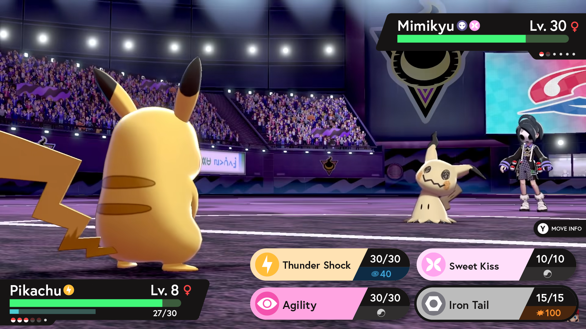
M O V E S E L E C T I O N I N T E R F A C E

O R I G I N A L
R E D E S I G N
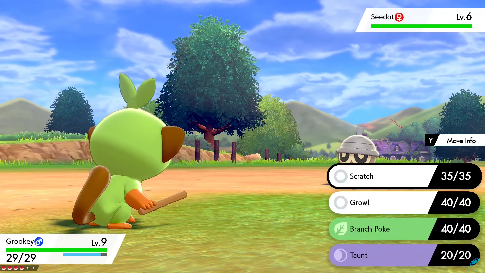
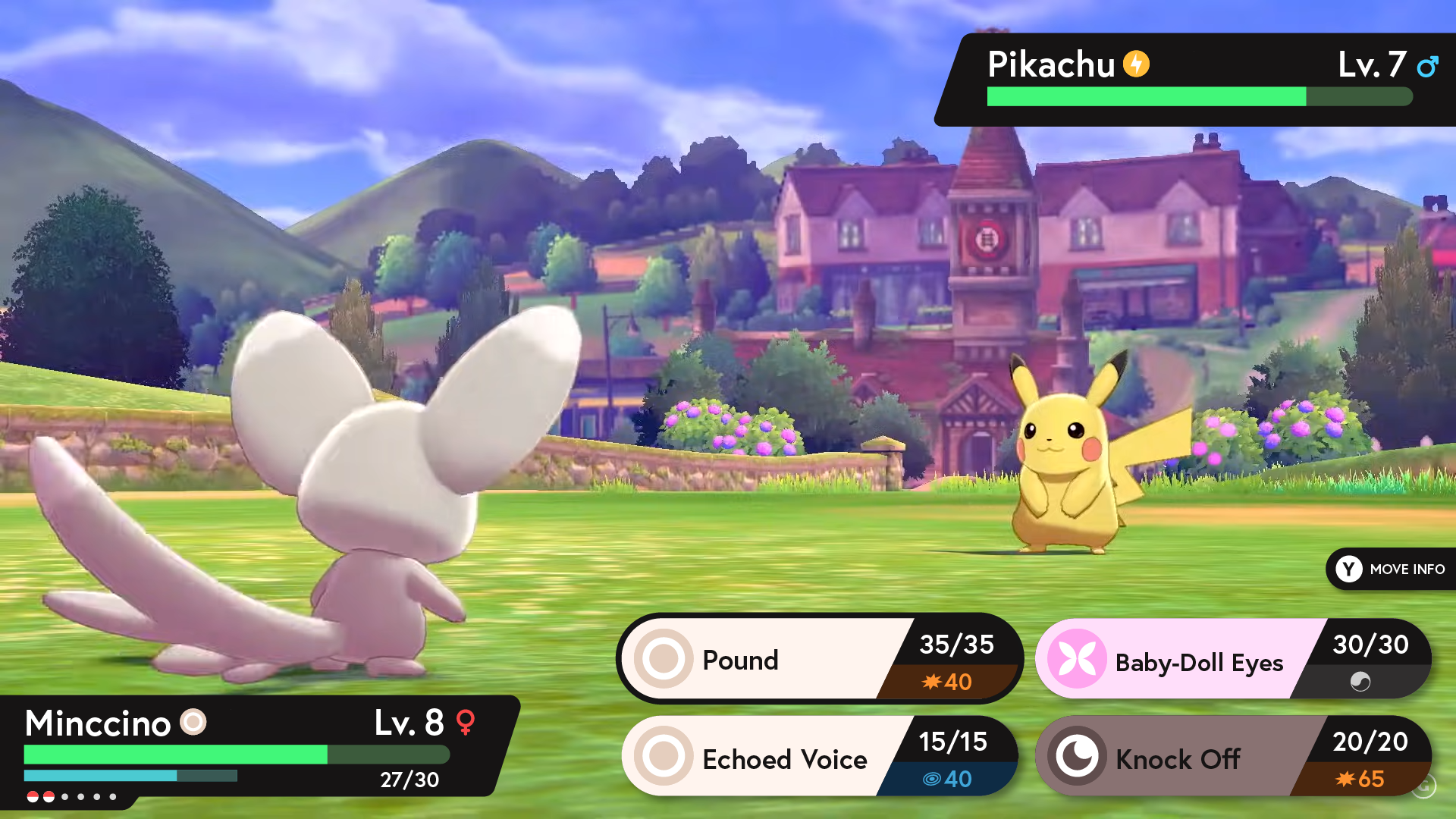
Opening up the visual space for the Pokémon.
Worse than before, the original UI elements are now covering up half of the Seedot. To fix this, I once again aligned most of the elements alongside the bottom of the screen.
Enhancing gameplay clarity.
It is not immediately clear which moves will do damage and which will apply an effect on the other Pokémon. For this, I added an indicator under the Power Points displaying how much damage will be done of either Physical or Special damage or if it is a Status type move.
B A T T L E I N T E R F A C E
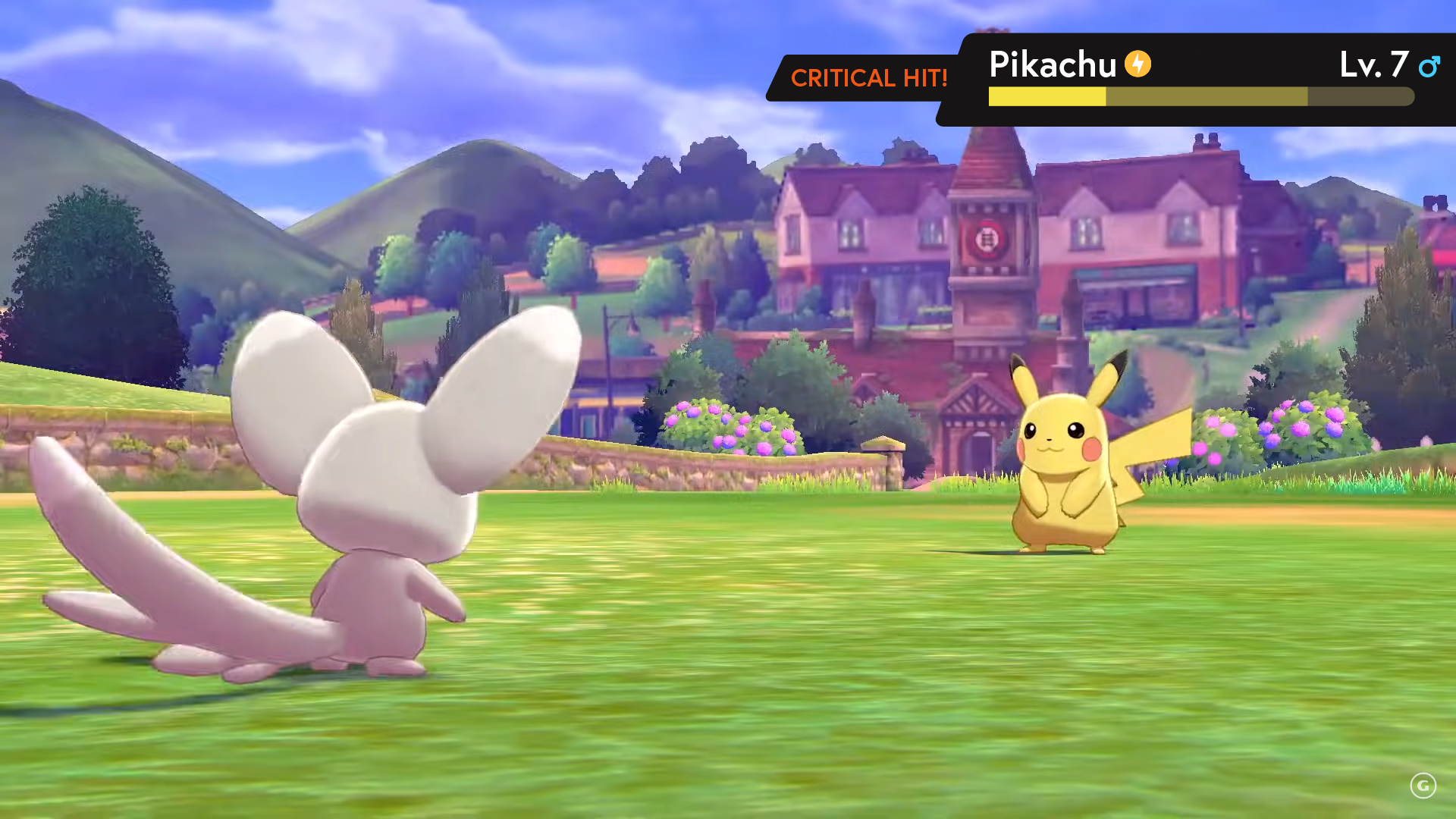
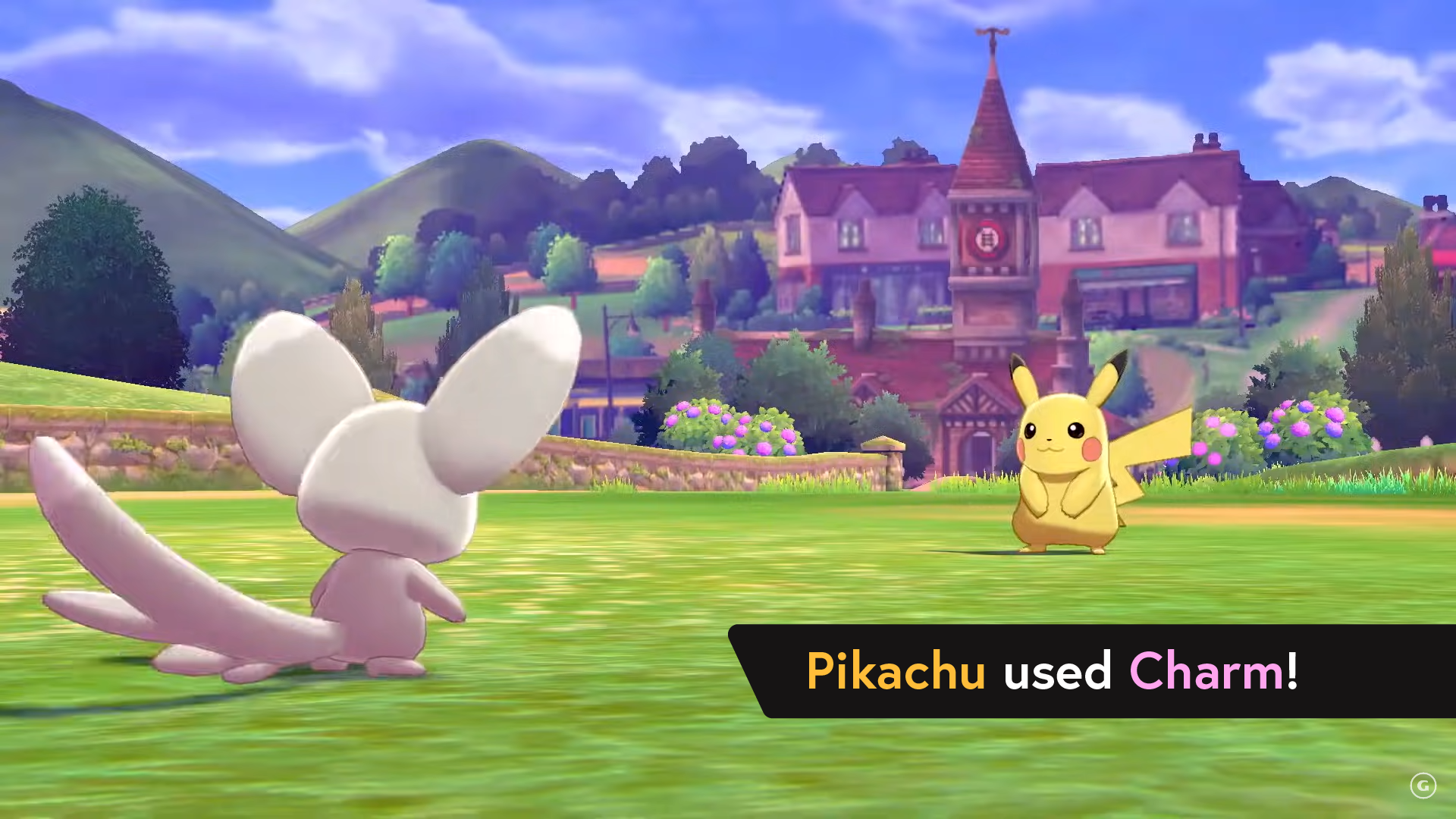


Making battles feel more immersive.
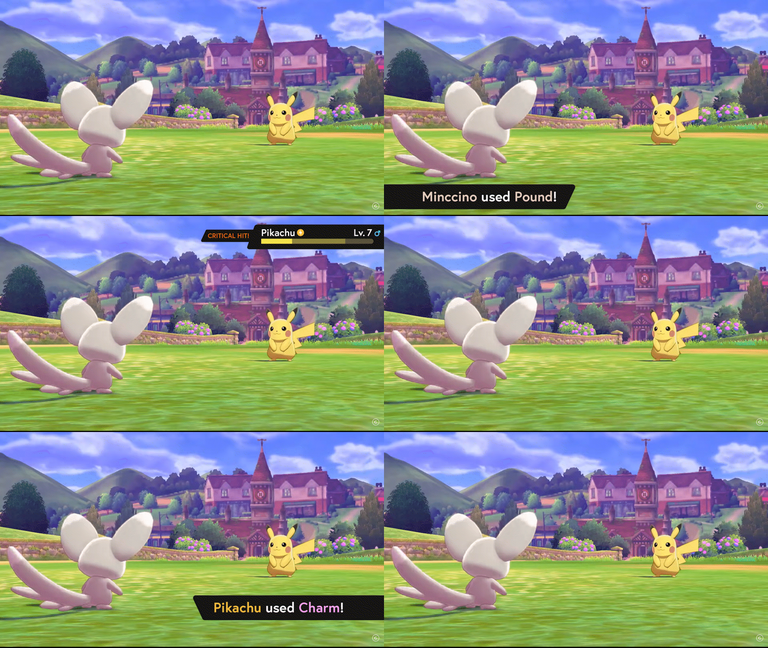
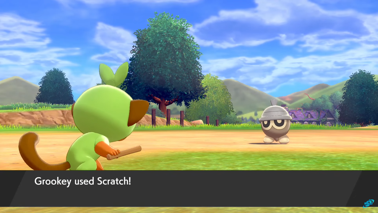
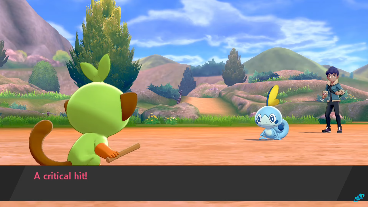
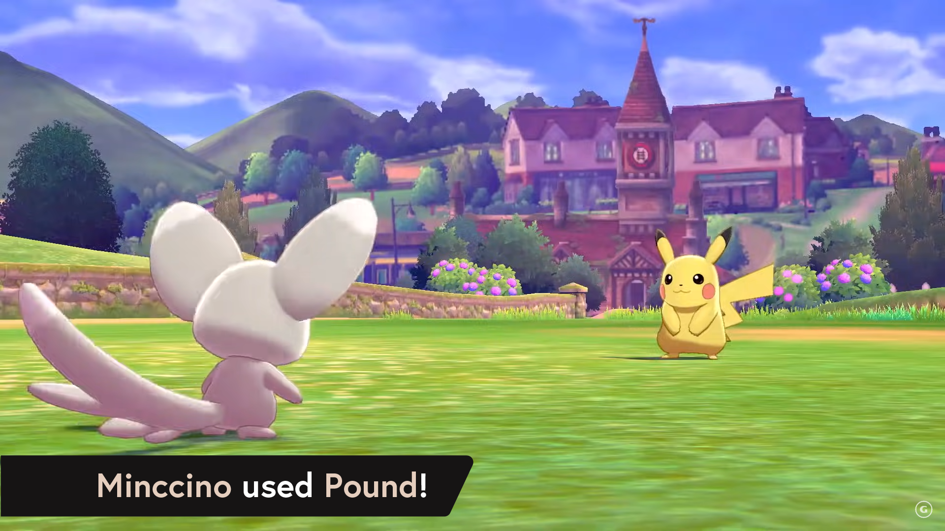
A major problem with Pokémon’s user experience is the amount of text boxes and pop-ups the player needs to interact with to get through. The stagnant text boxes also do not make these Pokémon battles feel exciting. Animated, real-time pop-ups suit the gameplay much better.
C A T C H I N T E R F A C E
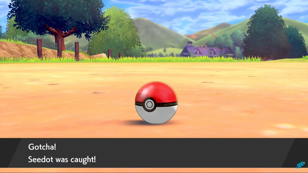
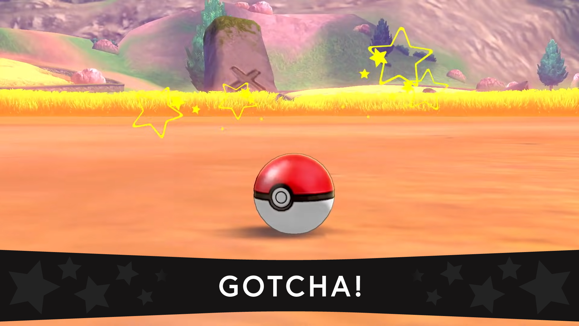
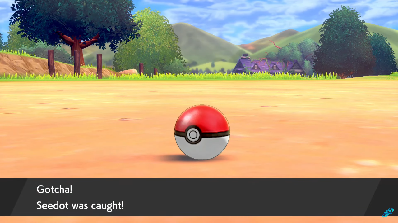
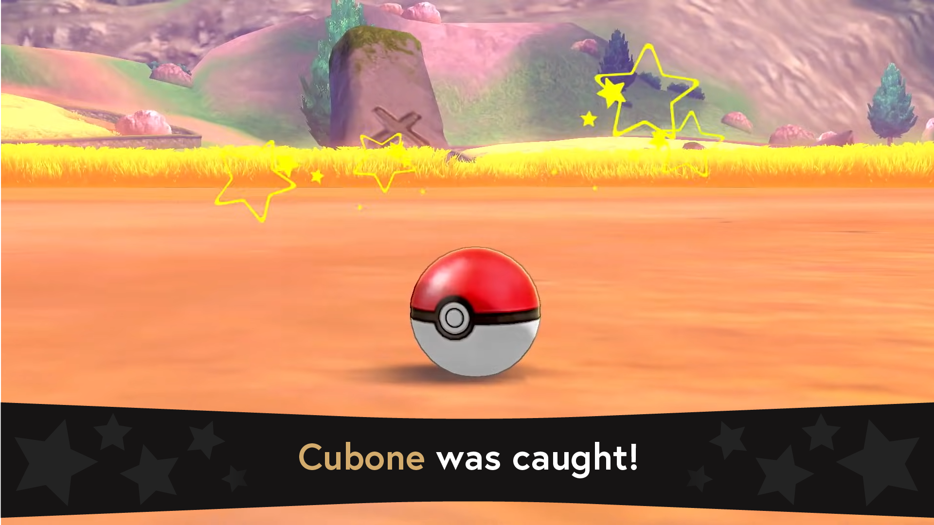


Making the interface more exciting.
Certain gameplay moments and mechanics deserve to feel more exciting for the player and need a matching interface for those moments. In the same style as the encounter graphic, this new design is more cinematic and feels impactful.
A D D I T I O N A L S C R E E N S
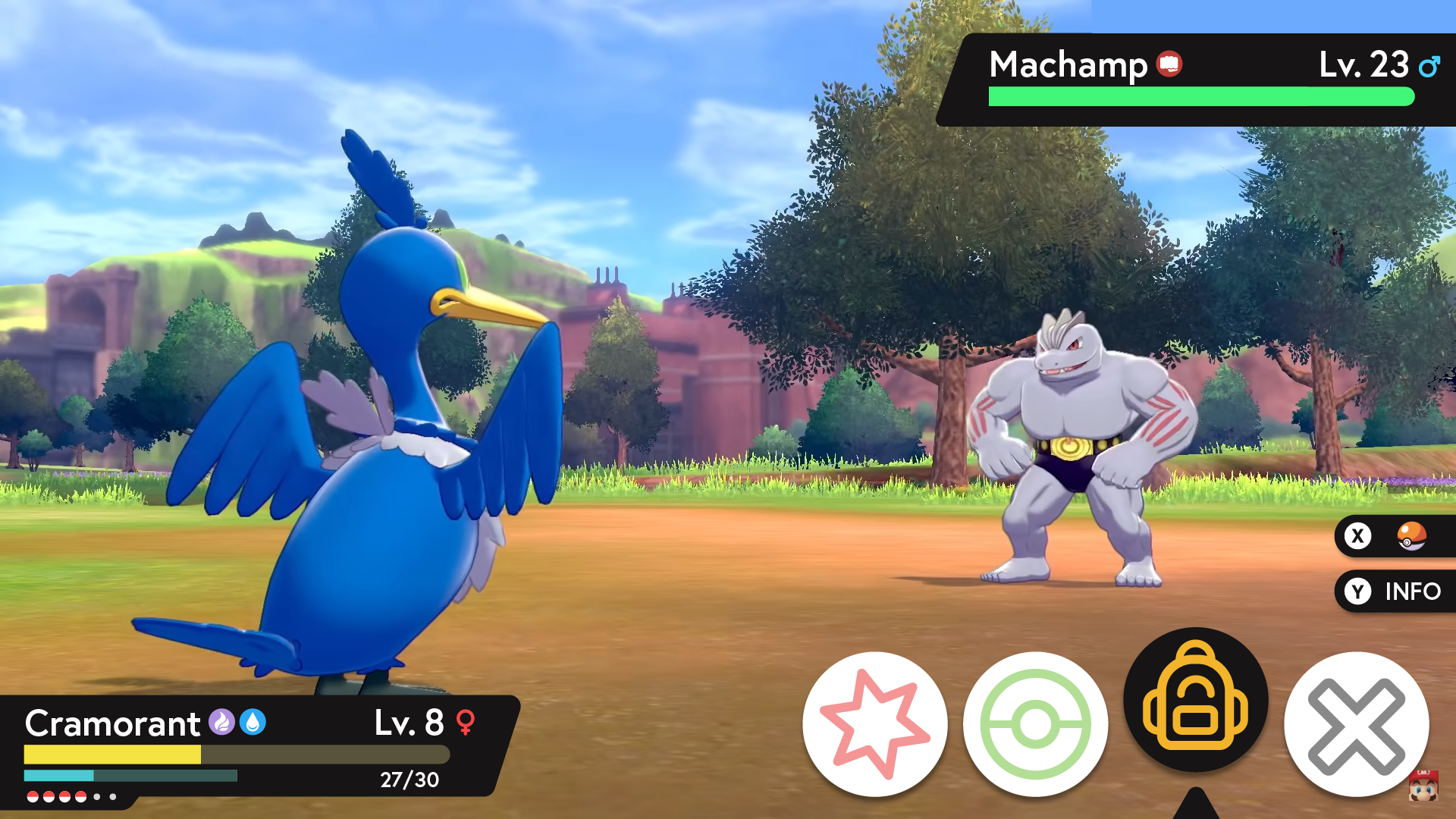
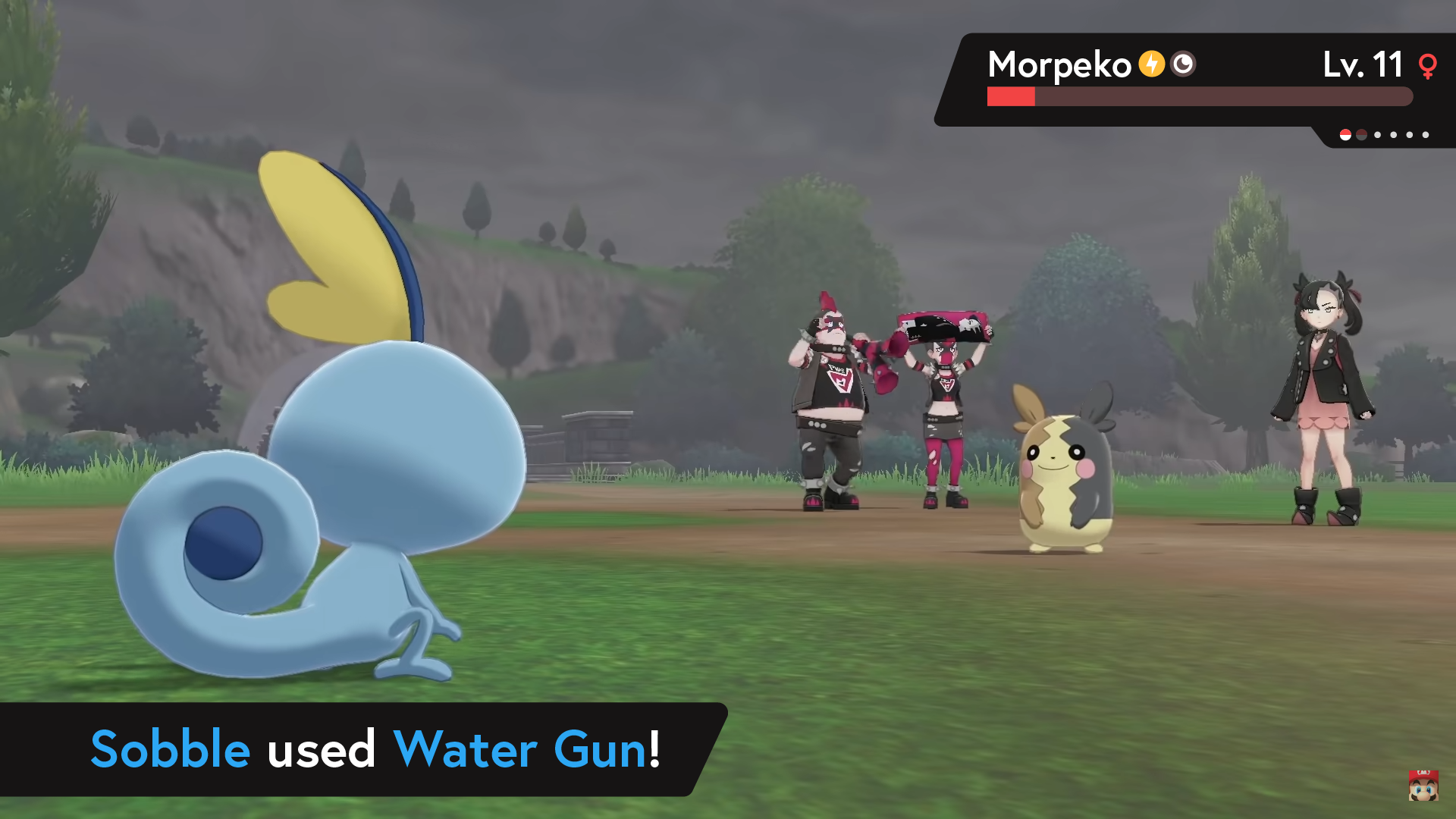

M O C K U P